Friday 25 November 2011

HMV Store Research by the group

 Our group went to HMV store to research existing albums being sold. We focused on the R&B/Hip Hop genre which was positioned at the back of the shop. Some of the best selling albums were featured at the front of the shop under the Charts, and New Release section. This includes artists such as Rihanna, Drake and more. This tells us that people are more willing to buy CDs than performance DVD. We stood in front of a range of CDs to see which album catches our eyes. The album that we first saw which stood out to us was Rihanna, Far East Movement, and Jay Z.


This is Rihanna's album: 'LOUD'. This album caught our eyes due to the album colour scheme of Red, and Cyan. The album was also positioned at the top of the rack so it was very easy to be seen. The album is really simple and may seem boring to some people, but the album clearly promotes the artist due to the close up of the artist's face. This is effective because people will instantly recognise her.
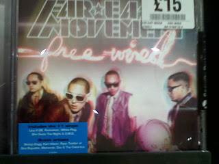

This is Far East Movement's album, 'Free Wired'. This caught our eyes because of the effects it has. These effects are appropriate, and relate well to its genre. The 3D effect on the image makes it original and make the artists stand out. The fonts are really effective because they are quite modern.


This is Jay Z's album. 'Blueprint 2.1'. This caught our eyes because of the colour scheme: the artist is in black and white which contrasts the bold orange background. The artist is looking directly at the viewer suggesting authority, and power. This makes the artist the main focus of the album.

The shop was playing popular music that relates to young people. The songs that we heard were One Direction's 'What Makes You Beautiful', Goo Goo Dolls' 'Iris', and Cher Lloyd's 'With Ur Love'. This could mean that the shop maybe promoting new releases of artists. However, there are old songs that are being played as well, this could mean that the shop is attracting wider audience.

We also researched into the sales of Music DVD. The Music DVDs are located in a small section of the DVD section. The store mainly showcase Film DVDs as these are more popular.

This is Beyonce and Jay-Z music DVD (of their story) called 'Hip Hop's Power Couple'. The image on the front cover is promoting the two artists. The white background makes them stand out which makes them the main focus of the cover. The title is quite large and bold and is in capitals which makes it hard to miss.

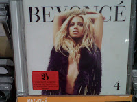
This is Beyonce's new album  '4'. One CD is the album and the other CD is the extended version. They show different images of the artist which is a good way to promote it the artist easily recognisable and people can remember it. The white backgorund makes it stand out and the image is in front of the artist's name which makes it look more releastic giving it a 3D effect. The image is simple, and the artist does not diorectly look at the viewer. The artist is very well known so she does not need to  over complicate the album covers.                                    

The next album is by Jason Derulo 'Future History'. The light/neon effect on the artist name is appropriate and fits the R&B genre well. This album has the artist on the front but he is not promoting himself in the coveras his face is turned away, showing he is already well known and his name is enough to be recognised by. he dark background also fits the genre.

The last album we looked at was called 'Lo(a)sers' By Lupe Fiasco. This is quite simple, and does not promote the artist. The neon lighting is interesting but doesn't really fit the genre, it looks like indie/rock. It quite limited and the artist name is smaller than the album title, but he is not a very well known artist so his name should be larger to promote himself.

Tuesday 22 November 2011

Digipak Album Design by Calvin


This is the front cover of our Album booklet. It shows an image of the artist dominating the cover which relates to the single, 'I Wanna Be A Star' and the album title 'Take.Over'. 


This is the back cover for our album. The image shows the artist with its shadow doing a different action which could be interpreted as the shadow is the artist's ambition. Beside it is the list of the songs in the album.


This is the front layout of the booklet which shows the Production Cast, a close up image of the artist, and the front cover.


This is the back cover of the booklet which shows Thank You message from the artist, a location shot, and another image of the artist. 


This is the booklet when partly opened. The viewer will be greeted with the Thank You message from the artist as well as the Production Cast which means that the album acknowledges its production and distribution. 

Album Name

As a group we wanted to call our album one word as this sounds and looks quite effective but is simple and easy to understand. We wanted a significant word our other album name ideas were: 'Gaze' (relating to stars) 'Takeover', 'Credit', Ambition, 'Merit', etc. We then chose Take.Over because our album shows the artists rise to fame, taking over the industry.We will call our album J.REYEZ 'Take.Over'

Monday 21 November 2011

Magazine Advertisment Analysis

We had a group discussion and looked at each magazine advertisement individually. Emily wrote down notes from what we discussed and she then created these:


(These are general magazine advertisements, we will go on to look at ones in our music genre.)

Usual Cover and Advertisement Structure Analysis by Ana

Typical Magazine Cover Structure:


Typical Album Advert Structure:


Magazine Selection By Calvin and Emily


XXL Magazine - This is one of our magazine choices, we chose this because its content is based on hip hop and mainstream artists and music genre. Our single, 'I wanna be a star' focuses on an artists rise to fame and wanting to become recognised in the music industry. our group feel our music genre is relevant to the magazine and that it will promote our music and the artist.


Rolling Stone magazine - This magazine is another choice we have as it a well known and recognised magazine, which was created in the late 60's. its target audience is teenagers to young adults, so we feel this is suited to our music genre as this is the target audience we are trying to reach. Well known artists have been featured in this magazine, this promotes the artist as the magazine is popular.


RWD - This is our last choice for our magazine selection. This is a UK based magazine, targeting the youth. It mainly focuses on the dance genre, but features new and up and coming artists in our music genre. Through this our music genre is being promoted to a wider audience.


From this research we have made three choices of magazine we feel would be the best to advertise our music genre and artist. Our first choice mainly focuses on R&B and Hip Hop so it is likely this magazine will promote our artist well. Both the first and second magazine choices we made are international magazines, which would promote our artist further. RWD will promote our music in the UK to our target audience. As this magazine is danced based and promotes parties and gigs this would allow the audience to create remixes with our music, further promoting our music and artist.

Music Magazines research and analysis, by Ana

Top pop/Hip-hop/R&B magazines:

-          Vibe Magazine
-          The Source
-          XXL Magazine
-          Rolling Stones
-          URB Magazine
-          Rap-Up
-          Spin Magazine
-          Right On!
-          Blues & Soul
-          Murder Dog Magazine
-          Scratch Magazine
-          Pound Magazine
-          The Situation
-          Elemental Magazine


I’ve been doing some research and decided to analyse these three music magazines because their content is based on different music genres. This will allow us to see the differences between them and to be able to choose the best one to promote our album.

1:
Rolling Stone is an international magazine founded in San Francisco in 1967 by Jann Wenner (who is still editor and publisher) and music critic Ralph J. Gleason. This magazine was known for its political coverage in the 1970s, however, in the 1990s it changed its format to appeal to a wider audience, often focusing on actors and pop music. This led to criticism that the magazine was emphasizing style over substance. 


2:
Vibe is a music and entertainment magazine that provides information on R&B and HipHop artists, actors and other entertainers.  After shutting down in Summer 2009, InterMediaPartners bought Vibe and is now issued four times a year with double covers. Now it has a larger online presence and it is aided by the Vibe LifeStyle Network, a group of entertainment/music websites under the Vibe brand. The magazine's target audience is young, urban followers of hip-hop culture.


3:
Spin is a music magazine founded in 1985 by publisher Bob Guccione Jr. In its early years, the magazine was noted for its broad music coverage with an emphasis on college-oriented rock music and on the ongoing emergence of hip-hop. The magazine was eclectic and bold, if sometimes haphazard. It pointedly provided a national alternative to the Rolling Stone's more establishment-oriented style. 


Saturday 19 November 2011

Font Analysis By Emily


Font Analysis


I am focusing on the font on these album covers and if they are effective, or not, and if they fit the R&B/ Hip Hop genre.

1. Chris Brown 'Fallen Angel':  This font is bold and uniquely shaped. The artists name  is quite large in comparison with the album name which is much smaller underneath, in a different colour. This font is quite detailed because of the small motif inside the 'O' and the underlining of the letters 'OWN'  which could hint at an underlining meaning. Overall this font fits the R&B genre well,especially because it is in capitals which adds a sense of power and success.

2. Jamie Foxx ' Best night of my life': This font really stands out against the dark background. The artists name also stretches to fill the width of the cover above the image of him, showing he is promoting himself as the main focus is on him. The album's name is much smaller underneath the artist name, but is in the same font which matches with the main title. All lettering on the cover is in capitals and the font is quite  modern and contemporary because of its curved edges and small details such as the gap which should connect the 'A' together.

3. Jazmine Sullivan 'Fearless'. This artist is not instantly recognizable from the album cover. This cover focuses on the artist and promoting her through large capital lettering which clearly shows her name so that people can see what she is called from a glance in a shop for example. The font is bold and quite wide/chunky bringing the viewers attention straight to her name and image. Her surname is in a smaller regular font which is stretched out with gaps in between and the album's name is all one word on the end. This font fits the R&B genre, but not as well as the previous two album covers. I think the artists image aids the font in looking effective.

4. David Guetta 'The world is mine' Feat. JD Davis: This lettering is positioned in the middle of the cover, unlike the three other covers I have looked at. This cover does not feature a image of the artist so the font is the main focus of the cover. The artist name is the largest with the album's name only slightly smaller, showing that the artist is easily recognisable just by his name (and the font his name is always in on his album covers) so he does not need an accompanying image of himself. The 'Feat JD Davis' lettering is  very small showing a collaboration with another,less well known and recognised, artist. Overall this font definitely fits the R&B genre as it is in block capitals with interesting eye catching features such as all the A's are missing their central connections and the white contrasts against the dark purple/black background.

From this analysis I have found that these points make a good font that will fit our genre:
  • Capital/block lettering- suggests power and authority of artist
  • Colour of font should contrast against background or image if we want to promote our artist's name.
  • Large lettering for the artists name and slightly smaller lettering for the album's name.
  • Interesting features to our font: e.g logos/motifs, unusual layout or arrangement of lettering,etc.
  • Unique shapes/effects on title and name of album/artist.

Thursday 17 November 2011

Album Cover Discussion

Album/Digipak Analysis by Calvin

As we are creating our own Digipak we have to analyze some existing album digipak so that we get an idea of what is the appropriate content, and that our digipak does not go into the wrong genre.
This digipak is from Lil Wayne's Tha Carter III album. The album cover shows Lil Wayne as a baby, this style has been used by other artists too such as The Notorious B.I.G.'s Ready to Die:
Lil Wayne's digipak shows a lot of close up of him which could imply that he is marketing himself as well as his music. The use of two colours: black and red is effective as it maintains the stability of the digipak. 
This is Kanye West's Graduation Digipak. His digipak is very different from Lil Wayne as his shows more artistic side: cartoon, more than two colours, and none of his image. The cartoon bear could be Kanye West himself, this could be his alter ego as some artists sue such techniques to market themselves such as Nicki Minaj who uses a lot of alter ego (Harajuku Barbie, Roman Zolanski, and more), as well as Lady Gaga (Jo Calderone). This technique allows their target audience to see a different side of the artist, this could mean that the artist has more than one side and that the audience could see a different yet same artist and increase the acknowledgement of the artist. 
Front:
We could see by the front and back of the digipak that it has some kind of narrative or whatsoever. It shows the bear setting off with its jetpack. This links to the title 'Graduation' which means that now that he is graduated he can now reach more freedom. We could also see some features of future reference such as the DeLorean which is famous from Back To The Future series, A jetpack. This could mean that his music has techno-futuristic flair to it.
Back:
Inside his digipak contains the cd, as well as the list of songs, acknowledgement to the production cast, and lyrics to each songs.

Wednesday 16 November 2011

Peer Assessment Feedback By Emily

Good points about our music video:
  • Mise-en scene enhances the effect
  • Lyrics and visuals are effective
  • Pace is well maintained
  • Good lip-syncing
  • Editing so far is on the beat and releates well to the genre
  • Excellent setings, especially the graffiti
  • Different shot types and distances
  • Characters and props
  • Setting
  • Use of night and daytime
  • Good costumes and clothing
  • The studio scenes
  • Good colourisation
  • The range of different angles we shot at
  • Good dancing fits within genre well
  • Good use of splitscreen
Things we need to improve on:

  • Lighting (which we are currently improve as well as the colour on each shot in our music video)
  • Effects and transitions, we need to experiment with these like others do with the R&B genre.
  • Improve some of our lip-syncing (we are doing some extra little bits of filming today, of calvin, so it is clear what he is saying)
  • More close-ups of Ana singing ( we can crop shots to allow this)
  • And one of our backing dancers, he was dancing awkwardly (!)

Thursday 10 November 2011

Editing List by Calvin

  • October 18 - Recording Studio
  • October 31 - First Chorus
  • November 1 - Opening
  • November 3 - First Chorus
  • November 7 - First Chorus
  • November 8 - First Chorus
  • November 10 - 2nd Verse
  • November 11 - 2nd Verse
  • December - Final editing: colour scheme, transitions and effects