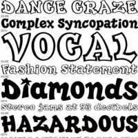
Font Analysis

I am focusing on the font on these album covers and if they are effective, or not, and if they fit the R&B/ Hip Hop genre.
1. Chris Brown 'Fallen Angel': This font is bold and uniquely shaped. The artists name is quite large in comparison with the album name which is much smaller underneath, in a different colour. This font is quite detailed because of the small motif inside the 'O' and the underlining of the letters 'OWN' which could hint at an underlining meaning. Overall this font fits the R&B genre well,especially because it is in capitals which adds a sense of power and success.
2. Jamie Foxx ' Best night of my life': This font really stands out against the dark background. The artists name also stretches to fill the width of the cover above the image of him, showing he is promoting himself as the main focus is on him. The album's name is much smaller underneath the artist name, but is in the same font which matches with the main title. All lettering on the cover is in capitals and the font is quite modern and contemporary because of its curved edges and small details such as the gap which should connect the 'A' together.
3. Jazmine Sullivan 'Fearless'. This artist is not instantly recognizable from the album cover. This cover focuses on the artist and promoting her through large capital lettering which clearly shows her name so that people can see what she is called from a glance in a shop for example. The font is bold and quite wide/chunky bringing the viewers attention straight to her name and image. Her surname is in a smaller regular font which is stretched out with gaps in between and the album's name is all one word on the end. This font fits the R&B genre, but not as well as the previous two album covers. I think the artists image aids the font in looking effective.
4. David Guetta 'The world is mine' Feat. JD Davis: This lettering is positioned in the middle of the cover, unlike the three other covers I have looked at. This cover does not feature a image of the artist so the font is the main focus of the cover. The artist name is the largest with the album's name only slightly smaller, showing that the artist is easily recognisable just by his name (and the font his name is always in on his album covers) so he does not need an accompanying image of himself. The 'Feat JD Davis' lettering is very small showing a collaboration with another,less well known and recognised, artist. Overall this font definitely fits the R&B genre as it is in block capitals with interesting eye catching features such as all the A's are missing their central connections and the white contrasts against the dark purple/black background.
From this analysis I have found that these points make a good font that will fit our genre:
- Capital/block lettering- suggests power and authority of artist
- Colour of font should contrast against background or image if we want to promote our artist's name.
- Large lettering for the artists name and slightly smaller lettering for the album's name.
- Interesting features to our font: e.g logos/motifs, unusual layout or arrangement of lettering,etc.
- Unique shapes/effects on title and name of album/artist.
No comments:
Post a Comment